Service
Logo Design Packaging Branding
Brief
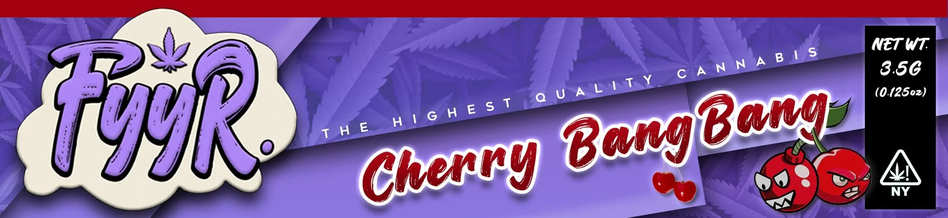
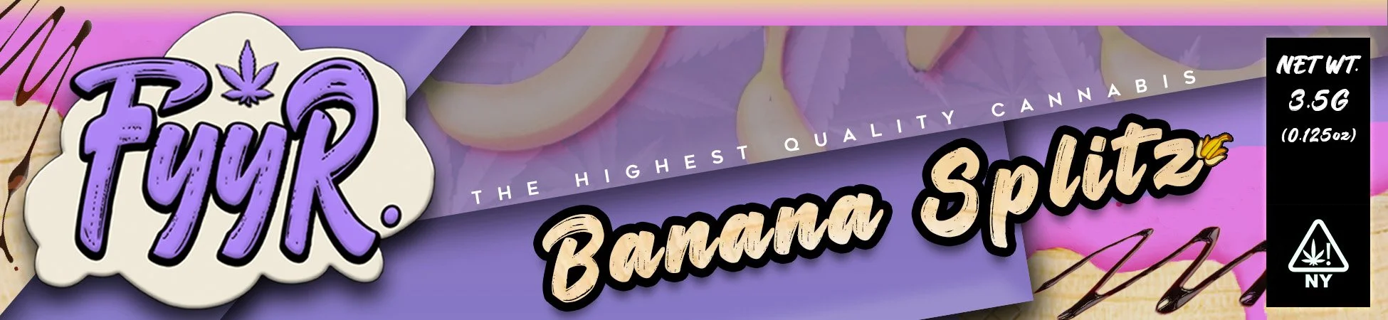
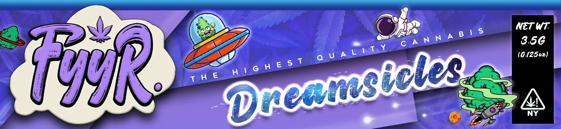
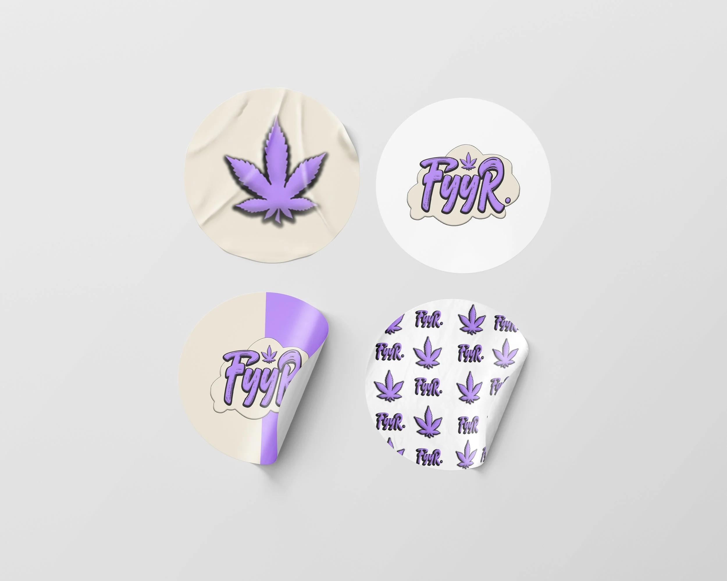
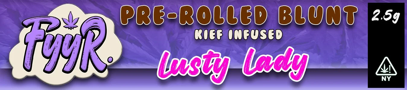
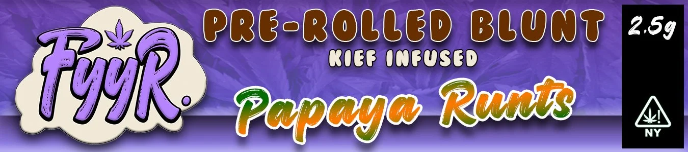
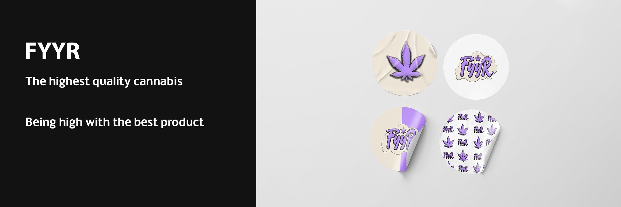
FYYR was requested to be visually appealing and stand out. The brand has various packaged flavors to be designed and requested they all be within the same branding, but have an individuality to it. The client also wanted different colors, not using any green.
Design
FYYR design goal was to be eye popping, without being childish since this is a canabis brand. The color purple was selected as a secondary color that may be found in the product. The font selection was specifically worked on to make the flavor pop consistently. The color of the font tied to what was being advertised was a focus as well.